Visualization #1 - This representation would help us figure out which month has usually high sales numbers
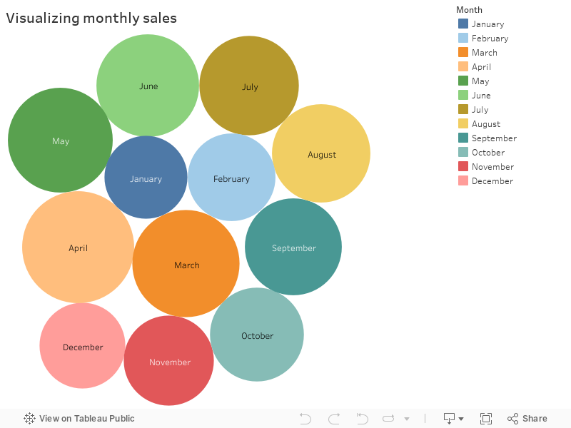
- Three months of year (Dec-Jan-Feb) has relatively weak sales figures compared to rest of year
- March-August trend shows good demand from customers resulting in increased sales
- Last few months of the year shows decreased demand. This could be seasonal factor/holidays/travel. This need to be validated
- January is the lowest period of sales
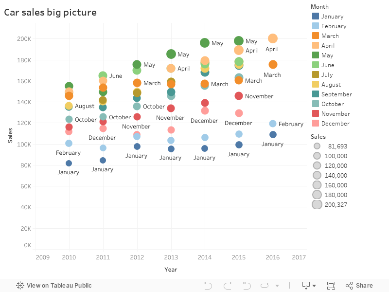
- Sales trend is increasing YOY (year over year)
- May month consistently tops high sales for many years
Visualization #3 - Data in simple table format
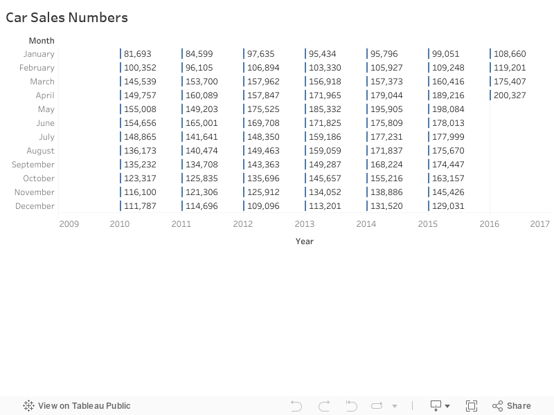
- Six years total sales data is represented
- Partial data is available for the year 2016


No comments:
Post a Comment